
Welcome to the fourth and final part of our series on essential tips for designing B2B websites. If you've been following along, you should now have a good understanding of learning all about your customers, why optimizing the navigation and your content strategy is key, how SEO techniques can help, responsive design being a crucial element, and how analytics can maximize website usage. Now we're going to wrap things up by discussing two of the most important elements of any successful B2B website: Incorporate Video Content (or Employ Quality Visuals) and Create Clear CTAs. Let's dive in and see how these two concepts can help you take your business to the next level!
Tip #7 Incorporate Video Content (or Employ Quality Visuals)
Incorporating video content on your B2B website can significantly increase user engagement and time spent on your site. Videos are a great way to showcase product demos, customer testimonials, and company culture. The use of videos can also help build trust with potential customers by providing them with an inside look into your business.
Let's face it, we live in a world that is driven by visuals. Gone are the days of people wanting to read through long-form pieces that describe every tiny detail about your business.
Optimize Visuals
Visuals are a crucial aspect of website design, and optimizing them can make a significant difference in the user's experience. One way to optimize visuals is by reducing their size without compromising the image quality. Large image files can slow down your website's loading time, leading to a high bounce rate. Compressing images or using tools like lazy loading can help improve load times and enhance the overall user experience.
Another way to optimize visuals is by selecting appropriate colors and fonts that match your brand identity and message. Consistency in color schemes throughout the site creates an appealing visual hierarchy that guides users' eyes from one section to another. The use of typography also plays a vital role in ensuring readability and accessibility for all users, including those with disabilities such as dyslexia.
 Finally, it's essential to ensure that all visuals on your site are responsive across different devices. With mobile devices accounting for over 50% of internet traffic globally, it's crucial to make sure that your visuals look great on screens of any size or resolution. By optimizing visuals for responsiveness, you'll create a seamless user experience regardless of where they access your site from- desktops, tablets or smartphones - while also improving SEO rankings by making your site more mobile-friendly.
When incorporating video content or visual elements into your B2B website design, it's important to ensure that they are optimized for fast loading times and mobile responsiveness. Slow load times or non-responsive visuals can lead to a negative user experience, which may deter potential customers from engaging with your brand. Optimizing images ensures faster page loads, reducing bounce rates and increasing engagement levels among visitors. You can also add alt text descriptions to your images that will help search engines understand what each image is about which improves overall SEO performance.
Enhance User Experience with Visuals!
Visuals are an essential element in improving user experience on your B2B website. By using high-quality images, videos and other visual elements, you can engage your visitors and make them stay longer on your site. Visuals help to break up large blocks of text and make it easier for users to navigate through the pages.
One way to enhance user experience with visuals is by using infographics. Infographics help you present complex data in a simple, easy-to-understand format that appeals to the visual senses of users. They are eye-catching and memorable which makes them ideal for sharing across social media channels.
One of the most important aspects of B2B website design is ensuring that your website is visually appealing and easy to navigate. In today's fast-paced world, consumers want to be able to quickly scan a webpage and get the information they need without having to read through long paragraphs of text. This is where visuals come in handy. Incorporating relevant images and videos into your website can help break up text-heavy content and make it more digestible for visitors. If you want to read more about optimizing your website navigation check out our blog - 8 Must-Know Tips for B2B Website Design (Part 1)
Use Quality Visuals
But it's not just about adding any old image or video to your site. It's important to choose visuals that are high-quality, relevant, and add value to the content on your page. For example, if you're writing an article about the benefits of using a particular product or service, including a testimonial video from a satisfied customer can help add credibility and convince potential customers to take action.
 Quality visuals are essential for B2B website design. They can help to break up blocks of text, create a visual hierarchy, and draw attention to important information. When selecting visuals, it's important to ensure they align with your brand identity and message. This means using consistent colors, fonts, and imagery throughout the website.
One way to ensure quality visuals is by investing in professional photography or graphic design services. High-quality images can make a significant difference in the overall look and feel of a website. Additionally, using infographics or charts can be an effective way to communicate complex data or information in a visually appealing manner.
It's also important to consider accessibility when incorporating visuals into your B2B website design. This means ensuring that all images have alt tags for screen readers and that any videos have closed captions available. By prioritizing quality visuals that align with your brand identity and message while considering accessibility needs, you can enhance the user experience on your B2B website while effectively communicating your message to potential clients or customers.
Overall, incorporating visuals into your B2B website design can help improve user experience, increase engagement rates, and ultimately drive more conversions for your business. So don't be afraid to get creative with your visual content - it could make all the difference in how successful your website is!
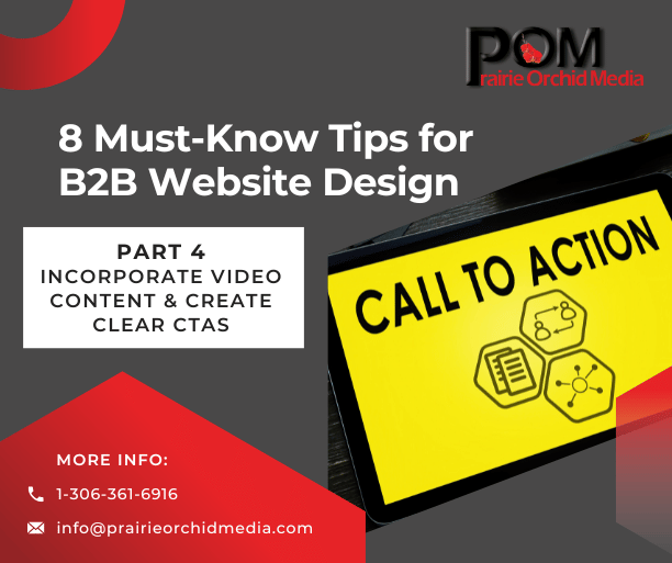
Tip #8: Create Clear CTAs
Clear CTAs or "Calls to Action" are an essential component of any B2B website design. These buttons, links, or messages prompt visitors to take specific actions such as downloading an eBook, scheduling a demo, or subscribing to a newsletter. As such, CTAs must be clear and easily noticeable.
Offer a Clear Value Proposition
If you are selling a product or service, then it's important to clearly convey what value your website offers.
One of the most important aspects for any B2B website is to clearly convey the value that your product or service offers. This means highlighting key features and benefits of your offerings, and demonstrating how they solve specific pain points that potential customers are facing. It's essential to avoid using vague or generic language, as this can make it difficult for visitors to understand what sets you apart from your competitors.
 To effectively communicate your value proposition, consider using descriptive language that paints a picture of how your product or service can improve the lives or businesses of those who use it. Use customer testimonials and case studies to provide social proof and demonstrate how your offerings have helped others in similar situations. Additionally, make sure that all information on your website is presented in a clear and organized manner, with easy-to-navigate menus and intuitive page layouts.
Ultimately, if you want visitors to convert into customers, then it's critical to ensure that they understand exactly what they stand to gain by doing business with you. By showcasing the unique value that you offer and making it easy for people to learn more about what sets you apart from competitors, you can create a strong foundation for success in the competitive world of B2B sales.
Make Your CTAs Stand Out
Simply adding a CTA button to your website isn't enough. You need to make sure that it stands out and catches the attention of your visitors.
Firstly, you can try using contrasting colors for your CTA buttons. This will help them stand out from the rest of the page and draw attention to them. Additionally, you can use larger font sizes or bold text to make sure that they're easily visible.
Another way to make your CTAs stand out is by using persuasive language. Instead of just saying "submit" or "download," try using actionable phrases like "Start Your Free Trial Now" or "Get Your Ebook Today." This will create a sense of urgency and encourage visitors to take immediate action. Using action-oriented words like "Download," "Subscribe," or "Register" can also increase click-through rates.
When selecting colors for your CTAs, consider using complementary colors that contrast with the rest of your website's color scheme. For example, if your website has a predominantly blue color scheme, try using a bright orange or red for your CTA buttons. This will make them stand out from the rest of the page and draw the viewer's eye towards them.
In addition to contrasting colors, bolding your CTA text can also help it stand out. This draws attention to the call-to-action message while making it easier for viewers to read quickly. Don't be afraid to experiment with different font sizes and styles as well - just be sure that everything remains readable and legible across all devices!
Finally, it's important to place your CTAs in strategic locations throughout your website. Consider placing them above-the-fold on key pages or at the end of blog posts where readers are more likely to be engaged with what you have shared. By following these tips, you can ensure that your CTAs stand out and effectively drive conversions on your B2B website.
Keep In Mind Your Client Journey with CTAs
One of the key elements to consider when designing a B2B website is the client journey. To ensure that visitors have a seamless experience on your website, it's important to strategically place CTAs (Call-to-Actions) throughout their journey. A well-placed CTA can increase conversions and ultimately lead to more sales.
It's important to understand where in the client journey you want visitors to take action and what specific action you want them to take. For example, if your goal is for visitors to download a whitepaper, make sure there are clear and prominent CTAs on relevant pages such as blog posts or product pages. Additionally, consider using personalized CTAs based on visitor behavior or location for even greater effectiveness.
Additionally, pay attention to design elements such as button placement and color schemes on both your CTA and landing pages. These small details can make a big difference in guiding users through the conversion process smoothly and effectively. By focusing on these tips, you can improve user engagement and drive more conversions for your business.
Finally, don't forget about follow-up actions after the initial CTA has been clicked. Make sure there's a clear path for visitors after they've taken an action so they can continue through the buying process. By keeping in mind your client journey with CTAs, you'll create a user-friendly experience that drives results for both your business and your customers.
Finally, it's crucial that your CTA leads visitors through a seamless user experience by taking them directly to the desired landing page after they've clicked on it. With these tips in mind, creating clear and compelling CTAs can help drive conversions on your B2B website.
 B2B Website Series Conclusion
B2B website design is a crucial aspect of any business that wants to succeed in the digital space. By following the eight must-know tips we have talked about, you can create a website that not only looks great but also drives conversions and generates leads for your business.
Remember to prioritize user experience and ensure that your website is easy to navigate. Also, make sure that your site is optimized for mobile devices since more people are browsing the internet on their smartphones than ever before. Additionally, keep in mind that content is king; focus on creating high-quality content that provides value to your audience.
Lastly, don't forget about analytics! Tracking data on how users interact with your site can provide invaluable insights into what's working and what's not. By regularly reviewing this data and making adjustments accordingly, you can continuously improve your B2B website design and stay ahead of the competition.
Thanks for being part of the Prairie Orchid Media community, and we look forward to helping you reach your website goals this year. We offer a wide range of web development and design services to help businesses increase their web presence.