

Did You Know Users Spend Less Than 6 Seconds Looking at a Website’s Written Content?
This is not a lot of time to look at all the written content on your website’s pages. But here are a few things you can do to engage your users more with your content:
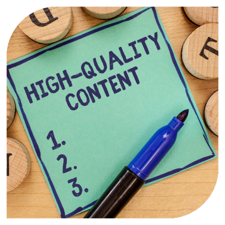
Make Text Scannable
Are you tired of reading endless blocks of text? Have you ever found yourself zoning out mid-paragraph and forgetting what you just read? Fear not, my friend! Making your text scannable is the key to keeping your readers engaged and informed.
Put the most important information at the top of your page (or above the fold as some may say) and make sure text is easy to skim. Most of your visitors will scan the page to find the specific piece of information they’re looking for and if they don’t find it easily, they’ll move on to another site (possibly to your competition).
Have you ever noticed yourself doing this before? If not, pay attention to how you react the next time you go to a webpage you haven’t visited before. Are you reading every word from beginning to end? Or are you jumping around, looking for the information you wanted to see?
First things first, break up that text! Use headings, subheadings, bullet points, and numbered lists to organize your information into bite-sized chunks. This not only makes it easier for readers to find the information they need but also helps them retain it. Plus, who doesn't love a good bullet point?
 Another tip is to use bold or italicized font for important keywords or phrases. This draws the reader's attention to the most crucial information and emphasizes its significance. Just be sure not to go overboard with the formatting - too much bolded text can be overwhelming (and a little obnoxious).
Use Short Sentences
Short sentences are easier to read.
Don’t overwhelm your visitors with big chunks of text. They won’t know where to start reading and/or won’t be able to take in all your content.
Try to mix it up. If you need a long sentence, follow it with a short one. Variation helps mix it up!
Use Shorter Paragraphs
Just like using short sentences, use paragraph breaks to your benefit. I understand that you may want to write longer paragraphs but try to keep your homepage paragraphs to a few sentences.
Start each paragraph with new information so if a visitor is scanning your page, they can quickly tell if they need to read that paragraph.
Get rid of pointless text on your pages so that you reduce clutter, which will help put more emphasis on your call-to-action (CTA). With this in mind, have your CTA stand out alone in its own paragraph so that it’s more impactful than if you place it in a bunch of text
The Fun of Using Bullet Lists
Instead of adding paragraphs, consider using bulleted or numerical lists. Instead of one long page of text, organize content into labeled tabs.
- 70% of people looked at lists with bullet points vs 55% of people looked at lists without bullet points.
- This is because bullet points help develop the scannability of your page and allow you to highlight the most important points you want to make.
Use Headers & Sub-headers to Break Up Text
It’s also important to divide content into sections with descriptive sub-headers. For example, look at the headers on this page. ?
Using Headings will help break up a page and make it easier to read.
These sub-headers help users navigate the page, but they also help search engines find your content, which increases your SEO ranking.
 Always Include “White Space”
This is the empty space that surrounds paragraphs, images, and other elements on your web page. This may seem like wasted space, but amounts of white space around text make it more legible, and more enjoyable to read.
Google has found that when a user first visits your website, it only takes them 50 milliseconds to form an opinion. Having white space on your site creates a cleaner image and will draw your users to the important elements on the page. Not only will this drive the user’s eye right to your content, it can also speed up conversions.
For those who are viewing your website on a larger screen, white space will improve the text’s readability. It’s difficult to read text that spans the entire screen.
The white space between paragraphs and around blocks of text and images also helps people understand what they’re reading and overall gives them a better user experience. The goal is to make people want to keep reading by laying out your text in a design format that’s easy on the eyes.
Too little whitespace can easily make your site look cluttered, cheap, and unreliable. But if you include white space on your website, it will convey feelings of ingenuity and freshness.
Thanks for being part of the Prairie Orchid Media community, and we look forward to helping you reach your website goals this year. We offer a wide range of web development and design services to help businesses increase their web presence.
Let's chat about your business' visibility online. Give us a call or send us an email to This email address is being protected from spambots. You need JavaScript enabled to view it.